Fee Experience
Led the strategic redesign of Chase’s fee experience—unlocking $15M+ in revenue potential and reducing support costs by 50%.
Overview
I led the transformation of Chase’s fee transparency experience, partnering with cross-functional teams to unlock a $15M opportunity and reduce cost-to-serve by 50%. Through a customer-centered service design strategy, we delivered proactive, intuitive tools that empowered customers to manage fees, make informed decisions, and take control of their financial journey.
The Challenge
The fee experience, as it stood, lacked both transparency and guidance. Customers had limited visibility into why fees existed, what value they covered, and how to avoid them. That gap led to confusion, frustration, and a growing sense of distrust — especially among deposit customers who felt caught off guard by charges they didn’t fully understand.
Challenge: How might we shift customer behavior towards fees so the experience feels intentional, not punitive?
My Role
We approached the fee transparency challenge as a service design opportunity—breaking the initiative into 3 distinct phases. I was the strategic design lead across a 7-person core team — overseeing design direction, managing design and research resources, and driving alignment across product, data, engineering, marketing, and content.
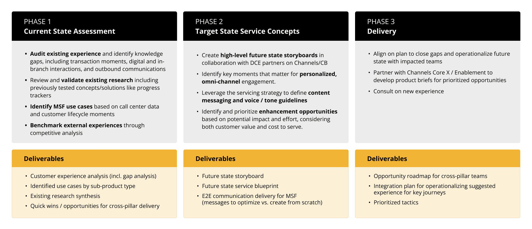
In my role, I led:
Omnichannel experience audit
Discovery and insight synthesis
Service blueprinting and behavioral modeling
Final design strategy and example solutions
Stakeholder alignment and narrative shaping
Discovery
Uncovering the systemic gaps shaping customer frustration
I led a comprehensive audit — not just of screens, but the full customer journey:
Mapped transaction moments, in-branch workflows, and outbound messaging
Validated earlier tracker tests and identified behavior gaps
Partnered with the data team to analyze call center data
Co-led workshops with marketing and content to frame customer mindset archetypes
Challenge: One early push was to launch a tracker tool — a solution inherited from the business banking team. I redirected the team to examine the underlying problem first: misaligned expectations, unclear triggers, and poor timing.
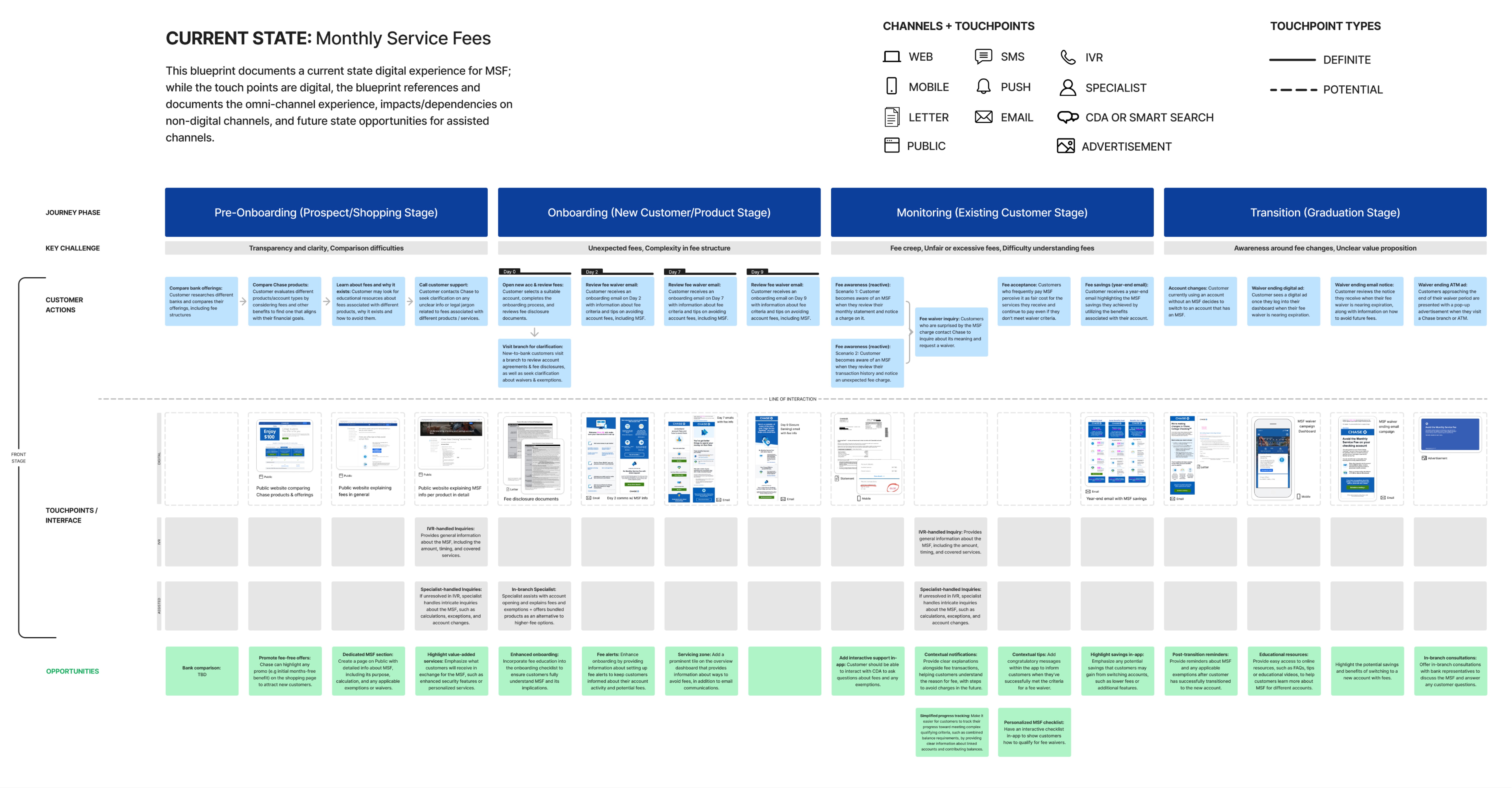
Service Blueprint
To make sense of all these fragmented inputs, I created a service blueprint — a collaborative artifact that visualized how digital, human, and system interactions aligned (or didn’t) across the full fee journey.
We used it as a neutral alignment tool to rally the broader team around. It became our shared map of the current state.
We broke the journey into four key phases — from pre-onboarding through account transition — and found meaningful gaps in each. I’ll zoom into two of those phases where the experience gaps were both most acute and most addressable through design.
Lifecycle Opportunities


Behavior Modes
When we looked at behavior across the journey, we saw patterns that weren’t about personas — they were about mindset.
I worked with the data team to run a call listening exercise. That gave us clues about awareness and intent, which led us to four behavior modes:
• Aware and Proactive — these folks understood the rules and took deliberate action to avoid fees.
• Unaware and Reactive — this group only noticed the fee after it hit.
Design needed to help users shift right and up on this map — toward understanding and confidence.

Strategy
That’s where our strategy truly took shape with the introduction of the Customer Continuum.
This simple framework helped us align around behavioral progression, not just segmentation.

Once we understood the different modes, I took a step back and mapped what I call the Customer Continuum — a behavioral spectrum that became foundational to our strategy.
On the left, you have customers who are unaware — these are the same folks driving call volume and attrition. And on the right, you have customers who understand the value of services and either accept fees or take steps to waive them. Our goal wasn’t to push people across this line — it was to design touchpoints that invite progression. To meet people where they are, and nudge them forward with clarity, timing, and trust.
This helped Chase reframe fees not as penalties, but as value-based mechanisms — things customers could understand, manage, and even appreciate.
Delivery
With the foundational strategy in place, we aimed to validate it and develop design solutions to present to our stakeholders and downstream teams for execution.
We zoomed in on what we call Moments That Matter — high-leverage points in the customer journey with the highest potential for impact.

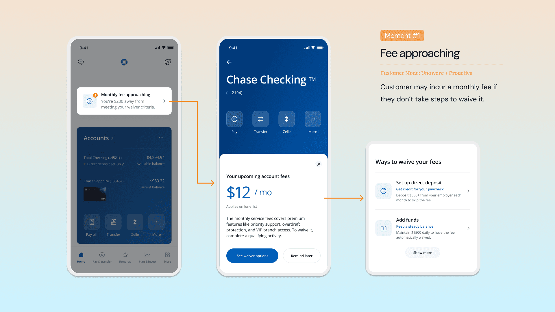
Moment #1 – Fee Approaching
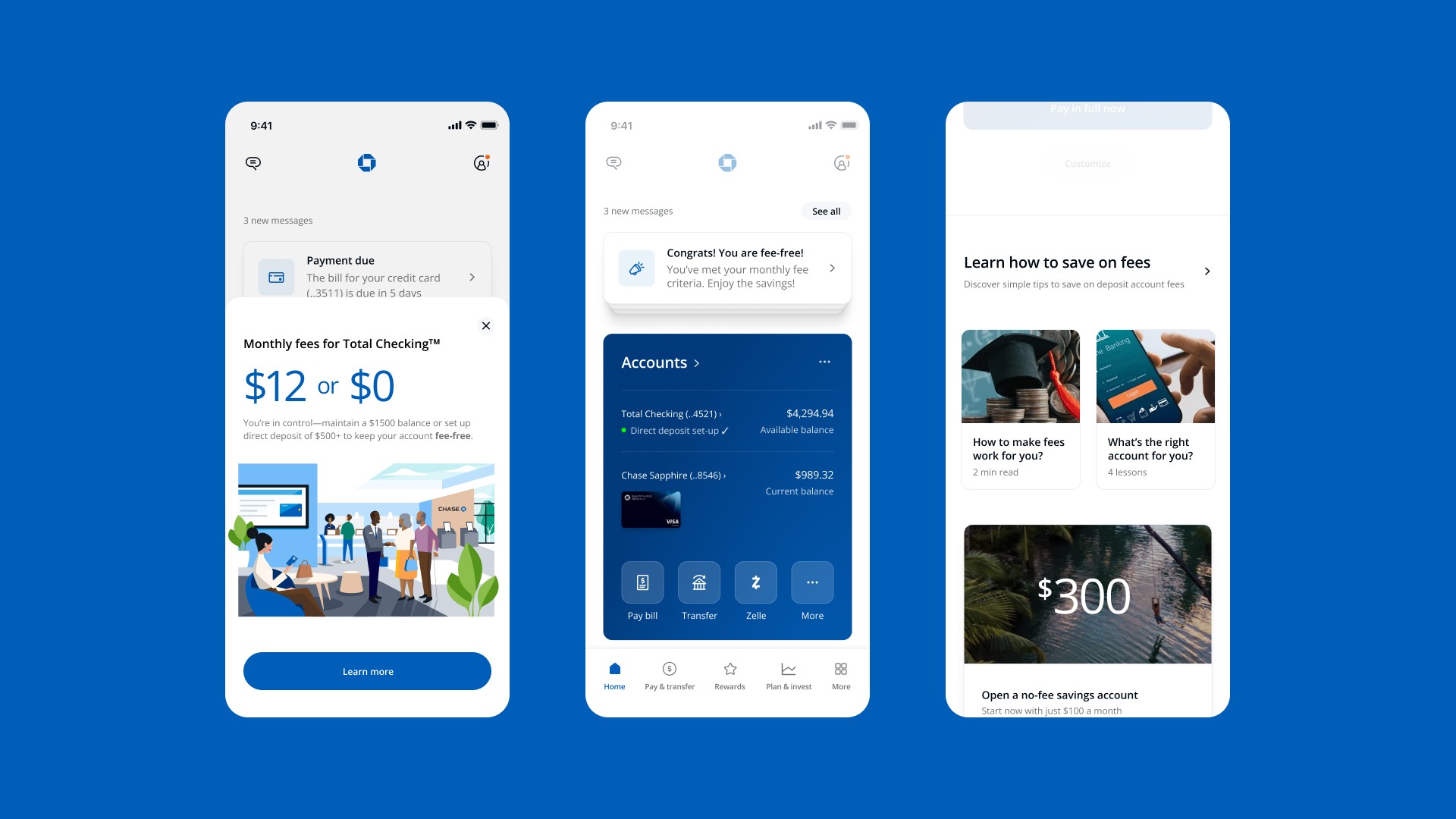
The first is when a fee is about to hit, and the customer still has time to avoid it. These were often our unaware yet proactive customers, who want to do the right thing, but lack clarity on how.
We created a fee alert with actionable guidance to show upcoming fees and next steps. When a customer is about to incur a fee, we send a contextual notification via push or in-app. Clicking on this notification takes them to their account, where a nudge provides key information about the charge, what it covers, and how they might waive it. By selecting "see waiver options," users are shown a personalized view of actions they can take to avoid the fee.
This helped customers feel supported before pain occurred — and created moments of earned trust.
Moment #2 – Fee Incurred
The second key moment occurs after a fee is charged, particularly affecting our unaware and reactive customers, who didn’t realize they were charged.
We tackled this in a few ways — by meeting users directly in the moment with clear, contextual explanations, and then guiding them to a more holistic view where they could see patterns, understand tradeoffs, and take action with confidence.

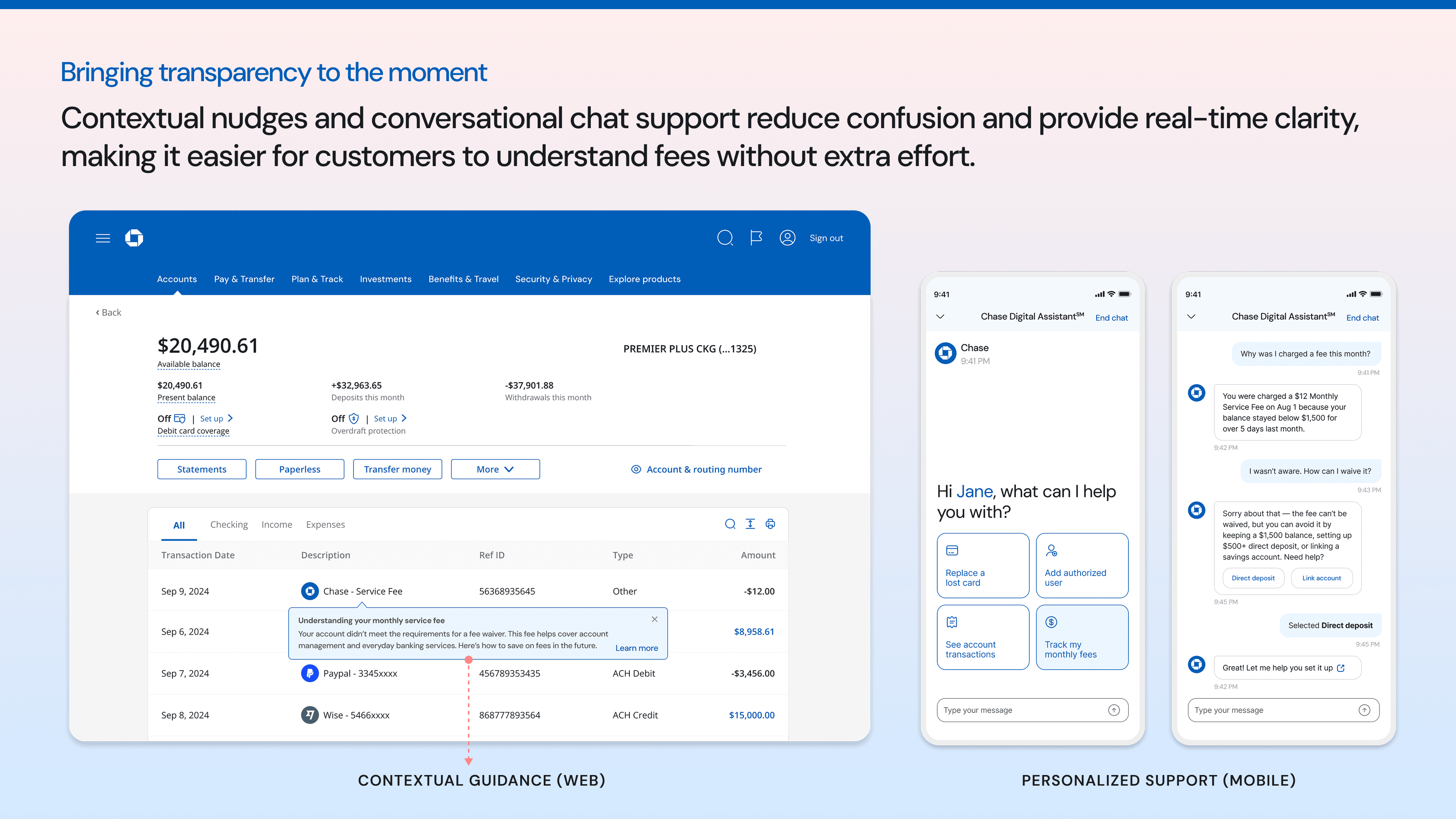
Bringing Transparency to the Moment
To reduce confusion and frustration after a fee is charged, I designed two lightweight, in-flow interventions that meet users right where they are—grounded in our nudge framework, messaging strategy, and personalization engine.
The image below shows both:
On the left: A contextual message integrated into the transaction detail page, pointing directly to the $12 service fee and briefly explaining why the charge occurred—eliminating the need to search elsewhere for clarity.
On the right: A guided mobile chat experience designed for users who turn to digital support first. It offers fast, conversational responses and points to helpful next steps, like learning about account options or exploring waiver criteria.
These touchpoints work together to provide real-time clarity, reduce support volume, and build user trust—laying the foundation for the full Fee Center experience that follows.
A centralized hub for clarity, control, and next steps
This is the Fee Center — a dedicated space where users can see the bigger picture and take control of their fee experience.
I designed it with three core principles in mind: transparency, actionability, and emotional reassurance. Instead of surfacing fee details in fragments, the goal was to bring everything together in one calm, informative view — past patterns, current status, and future options.
Each module was intentionally designed to do more than present data. The structure and layout guide users toward a sense of progress and control, without adding cognitive load.
Some modules inform. Others guide decisions. And a few provide immediate, supportive actions. Together, they shift the experience from reactive confusion to proactive clarity.
The image below shows how those pieces come together. I’ll walk through them next.

What It Took Behind the Screens
This wasn’t just about designing screens — it was about shaping the system:
Over the course of this project, I:
Defined a dual-path experience strategy — helping users both avoid fees and feel more in control when they’re charged.
Designed the Fee Center as a unified destination that brings together communication, insights, and next best actions across key user moments.
Created a scalable design system for fee-related touchpoints by aligning voice, legal tone, and data triggers across previously disconnected teams.
Led multi-disciplinary workshops and design sprints to drive cross-functional alignment and unblock decision-making.
Mentored junior designers through their first systems-level initiative, helping them navigate ambiguity and stakeholder complexity.

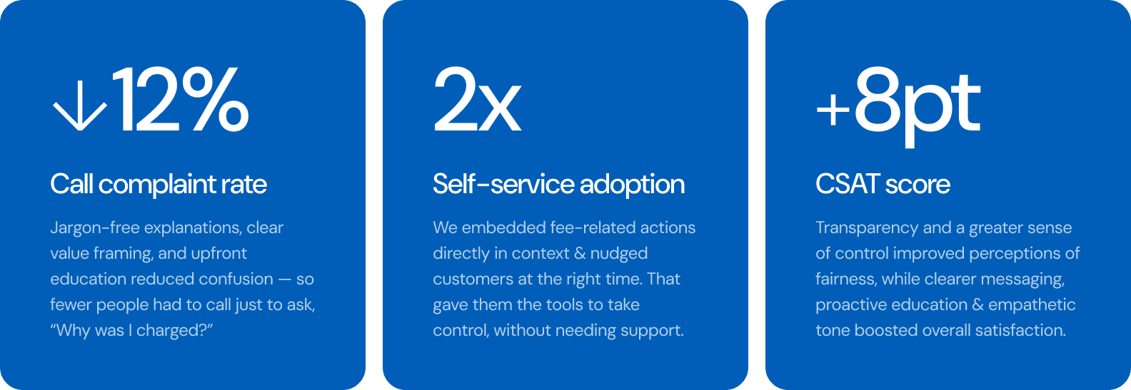
Impact
By embedding these principles across Chase’s omnichannel experience, we turned fee transparency from friction into a trust-building opportunity. The result was a more intuitive and proactive fee experience that:
Reduced customer frustration and confusion around fees
Increased engagement with self-service fee management tools
Reinforced Chase’s position as a customer-first financial partner
By reframing the conversation from fee avoidance to value, we aligned with Chase’s "We’ve Got Your Back" mission—empowering customers to take better control of their financial well-being.