Studio Connect
Designing the first scalable licensing platform for media distributors
Overview
As the founding designer of Studio Connect, I led the end-to-end design of this enterprise platform—from research and strategy to architecture, prototyping, and visual design.
Studio Connect is a web-based application that helps media content distributors manage licensing across digital platforms. Initial conversations with major studios revealed fragmented, manual workflows, and our research confirmed a market gap: existing tools lacked usability and didn’t support the full licensing lifecycle.
We built Studio Connect to fill that gap—streamlining complex processes and enabling seamless collaboration across the digital content supply chain.
Laying the Groundwork
Working in a lean, fast-paced environment, I jumped right into whiteboarding and organized several collaborative sessions with both the UI team and stakeholders. Involving stakeholders early helped align the team on the product vision and surface ideas that accelerated our thinking.
Over the next few days, I created low-fidelity sketches and paper prototypes to explore layout options and interaction patterns. Sketching is my go-to starting point—it helps bring ideas to life quickly, making it easier to evaluate, iterate, and get immediate input from users and partners.
Once core flows took shape, I translated them into wireframes using Balsamiq to visualize and test real use cases. With internal users readily available, we adopted a “test early, test often” approach—collecting fast feedback on what felt intuitive and what needed refinement.
Below are a few early screens that went through multiple iterations as the experience evolved.

Studio Connect - Merge row data
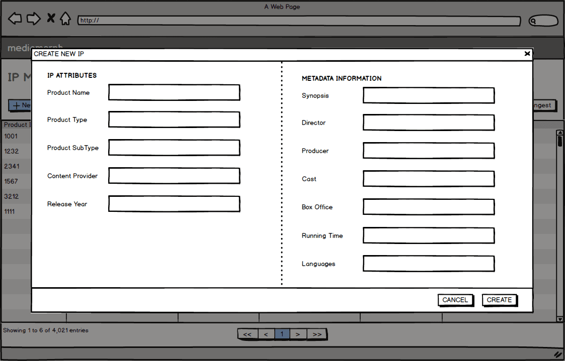
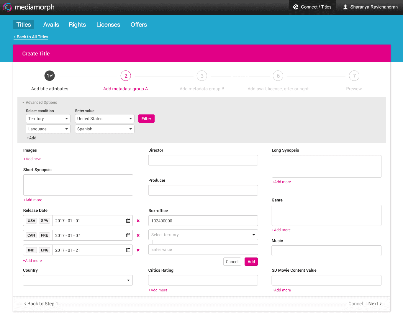
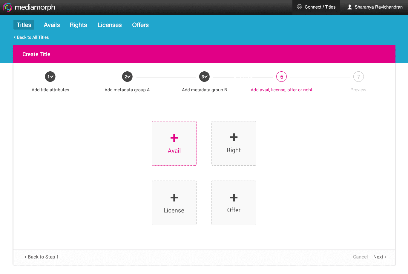
Studio Connect - Create form
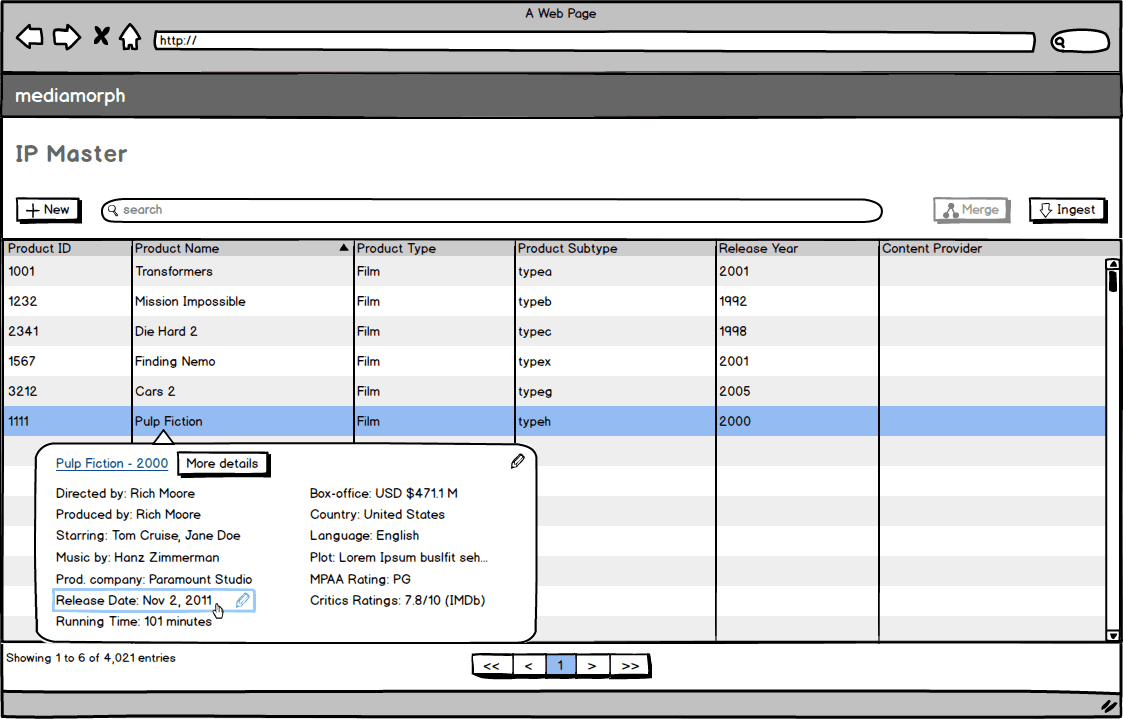
Studio Connect - Edit in-place

Studio Connect - Details view (top-slider tray)
Designing for an “Excel” mindset

Solution
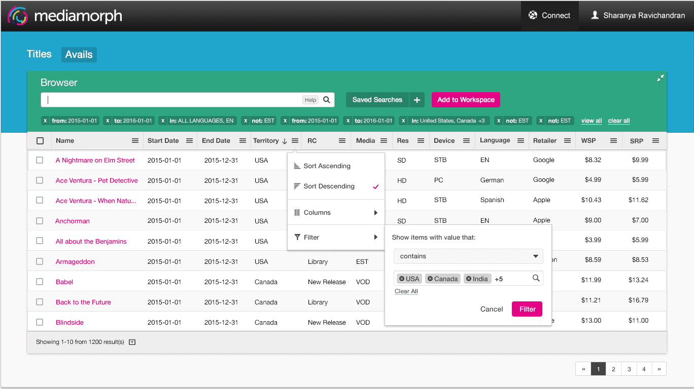
After testing with our users and whiteboarding various solutions, we came to the collective consensus to combine a few of the approaches mentioned above. This gave rise to our sophisticated column filter approach which gave users granular control over the data they were analyzing and making decisions on while ensuring they don’t lose the current operating context. A user could filter by various selection criteria like contains, not contains as well as perform an exact match, Combine this with the auto-complete search box and you have yourself an extremely powerful tool to slice and dice your data!Ideas we scratched out
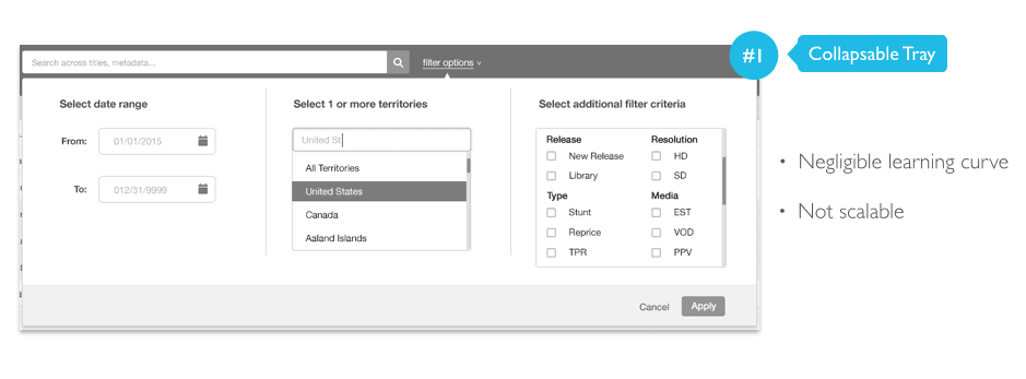
We went through a multitude of approaches, some of them being:
Collapsable tray with dedicated filter options
Tagged keywords with an extended search box that converted search keywords into tags
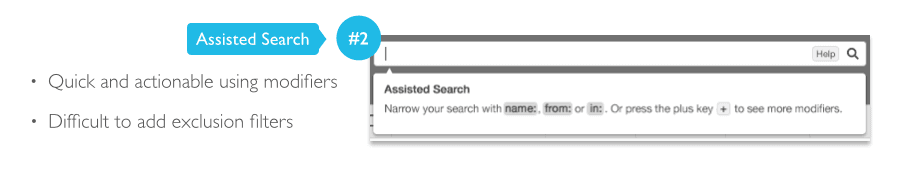
"Assisted search" which provided pre-set parameters to filter content by
Rule-based filters with added flexibility to include/exclude individual values
Though many of the tested approaches addressed different problems, none of the above provided an end-to-end solution.
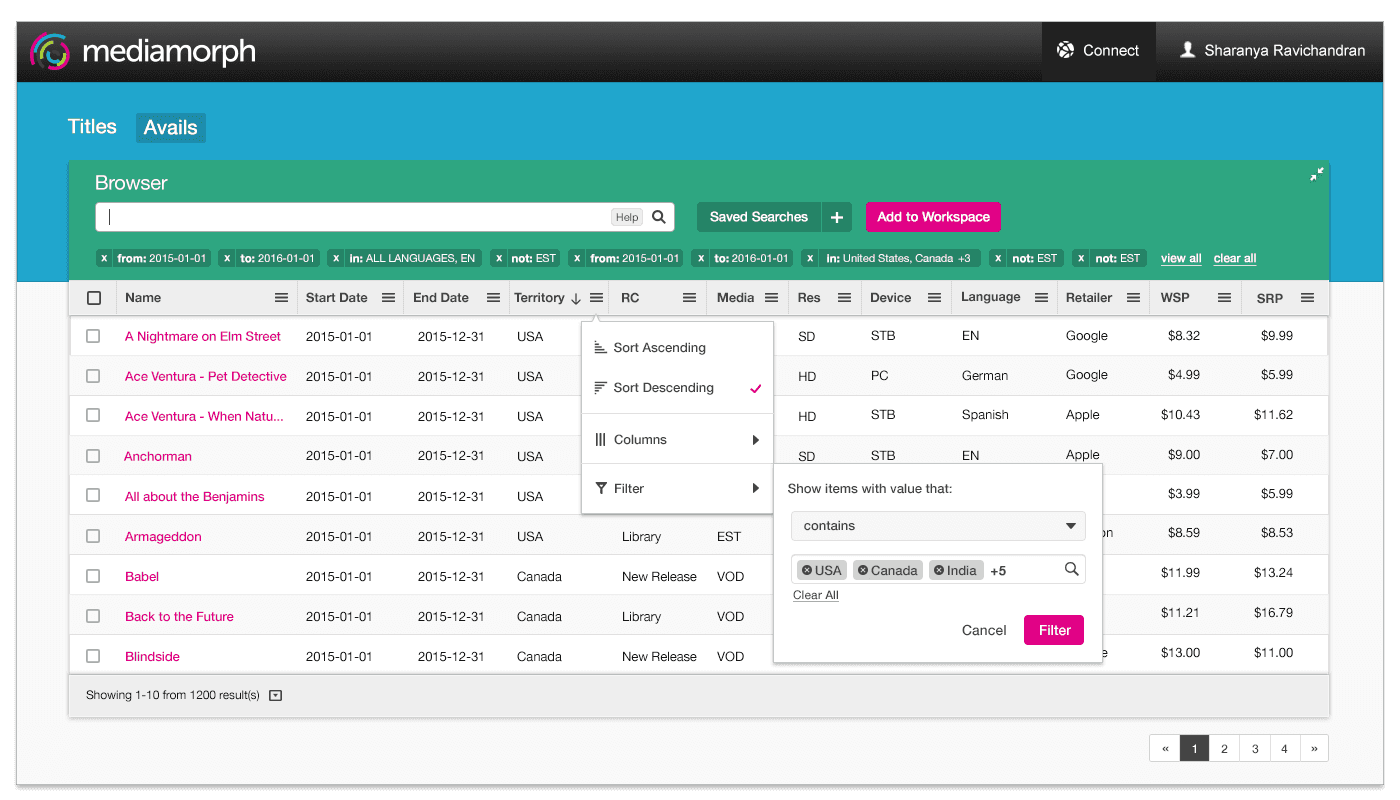
Studio Connect - contextual data filtering
STEPPED FORM (WIZARD)


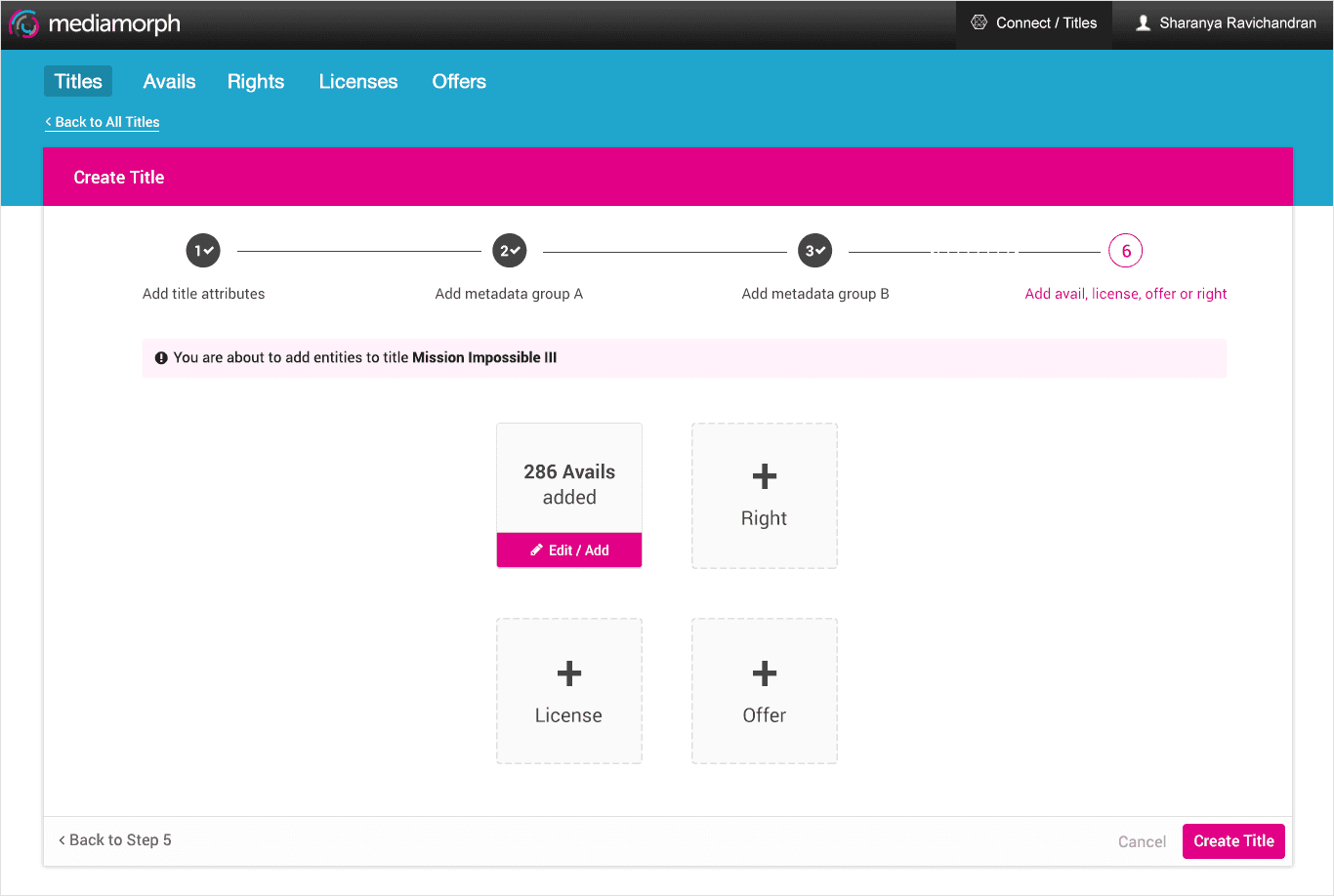

Studio Connect - batch editing
COLLECTIONS
Since many of the daily actions are done asynchronously, a user could come in one day make changes, enable filters, perform their analyses; and come back another day and take an action on the analyzed data. To provide users an easy way to reference this data later, we came up with the concept of "saving your current workspace as a collection". This tiny tool packed in a lot of power as it opened doors for cross-team collaboration, creating an approval workflow process and performing bulk operations.
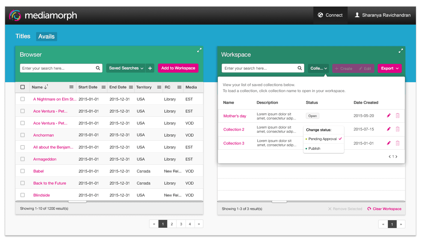
Studio Connect - collections popover
Usability Testing
Since we followed an MVP (Minimum Viable Product) approach, it helped us reduce actual complexity by eliminating unnecessary features. Our basic approach to gather feedback was to engage participants in one-on-one sessions, observe them and ask probing questions as they attempted to use the interface to accomplish tasks. One of the crucial takeaways was it helped us find where users got stuck. We validated some assumptions around our approaches and found pain points that the team failed to catch during the ideation and development phase.
Next Steps
After having successfully built version 1 of our product and testing it out with users, we used the data to build a product roadmap. It was important to center our roadmap on what problem areas we failed to address in the prior version and which ones we could work on improving. For cases where our assumptions were disproved, we planned to consider a pivot. Our mantra always being "fail fast, or keep climbing."